values 폴더 안에 color를 만들거나 colors 안에 밑에 색을 입력을 해주세요! 참고로 values 폴더 파일을 만들려면 values에서 오른쪽 마우스 클릭 후
new->XML->Values XML File에서 만들어주세요.
1 2 3 4 5 6 7 8 9 10 11 12 13 14 | <?xml version="1.0" encoding="utf-8"?> <resources> <!-- 색 아무거나 써도 됩니다~--> <color name="pressed1">#ff5959</color> <color name="pressed2">#524fff</color> <color name="focused1">#ffe924</color> <color name="focused2">#8bbee8</color> <color name="default1">#f044e7</color> <color name="default2">#3676f8</color> </resources> |
색은 일단 #000000으로 잡고 번호선? 옆에 정사각형으로 그 색이 나와요. 그 사각형을 클릭하시고 변경해주셔도 괜찮습니다~
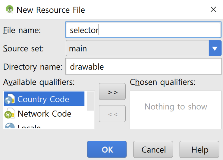
drawable->new->Drawable resource File
1 2 3 4 5 6 7 8 9 10 11 12 13 14 15 16 17 18 19 20 21 22 23 24 25 26 27 28 29 30 31 32 33 34 35 36 37 38 39 40 41 42 43 44 45 46 47 48 49 50 51 52 53 54 55 56 57 58 | <?xml version="1.0" encoding="utf-8"?> <item android:state_pressed="true" > <shape> <gradient android:startColor="@color/pressed1" android:endColor="@color/pressed2" android:angle="270" /><!--angle은 각도 입니다~ 0 45 90 180 270 360--> <corners android:radius="3dp" /><!-- 여기는 모서리 부분!--> <padding android:left="10dp" android:top="10dp" android:right="10dp" android:bottom="10dp" /><!--padding은 margin이랑 비슷한데 안쪽 여백을 정해줍니다--> <!--stroke android:color="@color/stroke" android:width="1pt"/--><!-- 여기는 테두리 부분!--> </shape> </item> <item android:state_focused="true" > <shape> <gradient android:startColor="@color/focused1" android:endColor="@color/focused2" android:angle="90" /> <corners android:radius="3dp" /> <padding android:left="10dp" android:top="10dp" android:right="10dp" android:bottom="10dp" /> <!--stroke android:color="@color/stroke" android:width="1pt"/--> </shape> </item> <item> <shape> <gradient android:startColor="@color/default3" android:endColor="@color/default4" android:angle="270" /> <corners android:radius="3dp" /> <padding android:left="10dp" android:top="10dp" android:right="10dp" android:bottom="10dp" /> <!--stroke android:color="@color/stroke" android:width="1pt"/--> </shape> </item> </selector> |
pressed는 눌렀을 때 나오는 버튼, focused는 초점이 맞추어졌을 때 맨 밑은 그냥 화면에 보이는, 즉 버튼을 눌리지 않았을 때 보이는 버튼입니다.
마지막으로 버튼에 "@drawable/selector" 추가하면 완성!
1 2 3 4 5 6 | <Button android:id="@+id/button1" android:layout_width="match_parent" android:layout_height="85dp" android:layout_weight="0.25" android:background="@drawable/selector"/> |
'code > 안드로이드' 카테고리의 다른 글
| [안드로이드] 이클립스와 안드로이드 소켓 연동! (0) | 2017.04.20 |
|---|